
A painting can look incredible in a gallery and strangely flat once it gets home. When that happens, the painting didn’t change. The light did.
Galleries put real money and thought into lighting. Most homes rely on a ceiling fan light, a couple of lamps and whatever comes through the window. The good news is you don’t need a lighting designer to close most of that gap. A few inexpensive changes make a big difference, especially with textured work like mine.
Why Paintings Look Better in a Gallery
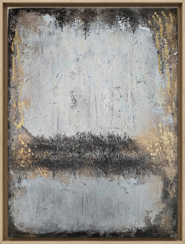 Two things are going on in a gallery. First, the art is brighter than the space around it. Your eye goes straight to the brightest thing in a room, so a lit painting on a dimmer wall pulls you in. A good rule of thumb is to light the art about two to three times brighter than the general light in the room.
Second, the light comes from a controlled angle, usually from above and slightly in front, so there’s no glare and no harsh shadow. At home, light tends to come from everywhere at once, and that flattens everything out.
Get the Bulb Right First
Before you buy any fixture, look at your bulbs. Two numbers on the box matter:
- Color temperature. This is measured in kelvins. For most homes, 2700K to 3000K is the sweet spot. It’s warm without turning everything yellow. Cooler “daylight” bulbs, 5000K and up, can make a painting feel cold and make whites look blue.
- CRI, or color rendering index. This tells you how accurately a bulb shows color, on a scale up to 100. Look for 90 or higher. Cheap bulbs in the low 80s make reds look muddy and blues look dull.
Stick with LED. LEDs run cool and give off very little UV, and heat and UV are two of the things that age a painting over time. If you have an old halogen picture light that gets hot to the touch, it’s time to retire it.
The 30-Degree Rule
The most useful number in art lighting is 30. Aim your light at the center of the painting from about 30 degrees off vertical. That angle is steep enough to keep glare from bouncing back at you and shallow enough that the top of the canvas or frame doesn’t throw a long shadow down the painting.
For a ceiling-mounted spotlight or an adjustable recessed light, that works out to roughly 2 feet out from the wall with an 8-foot ceiling, about 3 feet with a 10-foot ceiling, and about 4 feet with a 12-foot ceiling. You don’t need to be exact. Get close, then adjust by eye.
Picking a Fixture
- Picture lights. The classic bar light that mounts above the painting. Hardwired versions look cleanest, but plug-in and rechargeable LED models work if there’s no electrical box behind the wall. Pick one that’s roughly half to two-thirds the width of the painting. They’re great for small and mid-size pieces but can leave the bottom of a tall canvas a little dim.
- Adjustable recessed lights or track lighting. This is the gallery approach. One or two adjustable lights aimed at the art light it evenly without any hardware on the wall. If you’re building or remodeling, this is the one to ask your electrician about.
- Wall washers. These light an entire wall evenly and work well for a gallery wall or a group of pieces.
- Floor uplights. Easy to set up, but light from below throws shadows upward and tends to look theatrical. I’d only use them as a last resort.
Textured Paintings Need Light From the Side
 This is the part most lighting guides skip, and it matters a lot for work like mine. I build my paintings with crushed quartz, sand, lava rock, rust and gold leaf. That surface is a big part of the painting, and flat, straight-on light hides it.
Light from an angle is what brings texture to life. When light hits a raised surface from the side or from steeply above, every ridge throws a tiny shadow, and the painting suddenly has depth. Try this at home: shine a flashlight straight at a textured canvas, then slowly move it off to one side. You’ll watch the surface wake up.
Metallic work needs a little extra care. With the gold tones in Gilded Nocturne or the gold leaf in Aura of the Divide, move the light around until the gold catches without creating a bright hot spot of glare. A few inches of adjustment makes a surprising difference. I wrote more about why texture matters in The Anatomy of Texture.
Don’t Forget About Daylight
Natural light looks beautiful on art, but direct sun is hard on it. UV fades pigment over time, and the Texas sun doesn’t let up. Hang paintings where the light is indirect, and keep them out of spots where the afternoon sun hits them for hours. If you love a sunny wall, UV-filtering window film or sheer curtains help a lot.
Daylight also changes a painting throughout the day, and that’s a good thing. A textured, metallic piece looks one way at 9 in the morning and completely different at sunset. Your electric lighting should work with that, not fight it.
Put It on a Dimmer
If you do one thing beyond changing the bulb, put your art light on a dimmer. Turn it up when you want the painting to be the focus and down in the evening when you want the room to feel calm. Smart bulbs and plug-in dimmers make this easy without rewiring anything.
A Quick Setup Checklist
- Swap in LED bulbs rated 2700K to 3000K with a CRI of 90 or higher.
- Aim the light at the center of the painting from about 30 degrees.
- Make the art noticeably brighter than the room around it.
- For textured work, shift the light slightly to one side until the surface shows depth.
- Check it during the day and again at night, and adjust.
- Keep the painting out of direct afternoon sun.
See the Difference in Person
The best way to understand all this is to stand in front of a textured painting under good light. A good share of my work hangs at the Sugar Land Art Center & Gallery, 104 Industrial Blvd Ste Q in Sugar Land, where you can walk up to a piece and watch the surface shift as you move.
You can also browse the current collection online. If you want to know how a specific painting will behave in your room, ask me. I’m always happy to talk about light, angles and walls.